Posts tonen met het label invite. Alle posts tonen

donderdag 18 maart 2010

Schrank8 - Poster for Job Wouters

To announce the exhibition of Job Wouters in Schrank8 Home Gallery, I designed this poster. An inverted fine liner drawing is silk screened with white ink on black textured paper.

- poster 50 x 70 cm
- silk screening
at Amsterdams Grafisch Atelier.
- edition of 50
- Thanks a million to
Michiel Schuurman who is trying really hard to infect me with his silk screen virus...

- invite A3, folded
-
laser and inkjet print
- edition of 200

woensdag 17 maart 2010

Show & Tell - invites

Lately I'm into promoting my friends. Although they don't really need my promotion because they are great inspirational designers, I try to find good reasons to do it.
For the short period I have been teaching the first year's students at the HKU, I invited Michiel Schuurman, Simon Wald-Lasowski and Bart de Baets to show their work to the students. These designers all have been my class mates and I thought it was nice to show (off with) how different we all turned out.

- mini posters (A4)
- invites (A5)
- laser and inkjet print
- editions of 50

- Next time I'll be a better girl and ask a student to design the announcements. For now it were spontaneous plans which left me with no time for didactic thoughts.

vrijdag 29 januari 2010

Schrank8 - poster for Bart de Baets

To announce the exhibition of graphic designer Bart de Baets in my own home gallery SCHRANK8 I silk screened a poster. I used the alfabet Marker Dots which is composed out of two printed layers. Also see Marker Dots sample.


The poster (65 x 53 cm) is silk screen printed at the Amsterdams Grafisch Atelier under the kind guidance of Michiel Schuurman. Printed with black and white ink on blue paper in an edition of 55.

Invite (21 x 27,5 cm) for SCHRANK8, exhibition of Bart de Baets. Combination of inkjet print and laser print in an edition of 100.

- SCHRANK8 is self initiated, started in 2010
- poster and invite
- opening on friday Januari 29th, 17.00 - 20.00 hrs
- open on saturday January 30th, saturday february 6th, sunday february 7th from 15.00 - 18.00 hrs

dinsdag 30 juni 2009

КООСЬЕ / Coosje - birth card

Coosje was born on June 30th in Moscow and this is her birth card.


The card was sent in transparent bag, addresses were printed individually on each card.


- commissioned by Wendel and Sjeng
- folded card, 12 x 17 cm
- 160 cards, self produced
- Laser- and inktjet print

woensdag 4 maart 2009

Lanskip - Hotel Mariakapel

For the exhibition 'Lanskip' by Rebecca Birch and Charles Danby I drew this landscape as a invite design.


Detail / The front is printed in black, white and silver ink on gray cardboard.

- invite for Lanskip, commissioned by Hotel Mariakapel
- printed by Drukkerij Jan de Jong, Amsterdam
- size: 22.5 x 16 cm

woensdag 4 februari 2009

Land Art

This brochure was designed for 'Het Groene Woud' (The Green Forest), a nature area in the south of Holland. The brochure consists of short descriptions of ten LandArt projects that are going to be realized in the park, also it contains general information on the park and a map of the area. All these three items are designed as seperate booklets, joined into one. All the three booklets have a seperate design and cover.


Brochure, three different covers together are the cover-design. Booklet comes in a plastic cover


- assigned by NBKS, Breda
- printed by Calff&Meischke, Amsterdam
- 32 + 16 pages with map in plastic cover
- size 21 x 10,5 cm
- different kinds of paper, under which moss green nacre paper by Gmund, Conqueror and Hi Speed Opaque 70 grs
- On the works and/or concept presentation of Irene Fortuy (i.c.w. Arjan Karssen), Margriet Kemper, Kees Wevers, Xavier de Richemont, Wineke Gartz, Mariëlle Lapidaire, Frank Havermans, Marcel Smink, Jusuck Koh / Anemone Koh-Beck and Thomas Stricker
- With text by Margriet Kemper and poetry from Victor Vroomkoning

zondag 14 september 2008

ExperimentaDesign - Come to My Place

For the exhibition Come to My Place by ExperimentaDesign Festival I was asked to design the invite, brochure and signage. I had already designed a teaser for the festival. This teaser was the starting point for the rest of the design.

Brochure and invite

The typeface was constructed after measurements by Dom Hans van der Laan. I used it as reference to the 3D signage of the exhibition.


- commissioned by ExperimentaDesign, (Wendel ten Arve) Amsterdam
- brochure of 32 pages, 21 x 14.8 cm, stapled
- black & white, Dutch and English
- inside paper: Royal Print 80grs, cover paper: Emotion

maandag 14 april 2008

Experimenta Design - teaser

The Portuguese Design Festival Experimenta visited Amsterdam in September 2008. To get some attention for the festival, the organisation decided to commission several Dutch graphic designers to design a teaser to send around. My teaser only had to reveal the date and website of the festival. I designed a postcard/envelope . When unfolded, a ladder of patterns falls out of the envelope.


zaterdag 23 februari 2008

Dom Hans van der Laan - NAI Maastricht

For the exhibition on the monk/architect Dom Hans van der Laan I was asked to design two invites and three booklets. As a startingpoint I took the typeface constructed by Van der Laan according to his 'Dynamic number'-theory. I ended up not taking it as strict as he did and started playing around with the theme.
When a visitor comes into the exhibition he has to choose from which point of view he'd like to experience the exhibition. The three booklets 'Tijd' (Time), 'Kunstnijverheid' (Crafts) and 'Het verblijf' (The residence) give similar information from a different perspective.
The booklets and invites have been printed with different background colours, corresponding Van der Laans colour-theory, they have round corners and are bound with a blue piece of rope.


Two invites (left and right) and three booklets (middle).

I made a different interpretation of the typeface for each printwork.
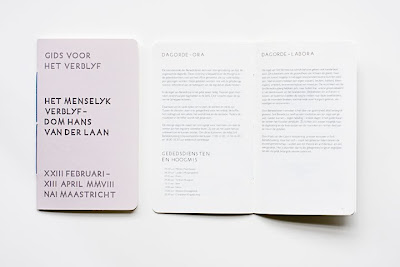
Each booklet is written in a different way, that way you experience the exhibition from a different point of view.

- Dom Hans van der Laan - Het menselijk verblijf - invites, brochures
- commissioned by NAI Maastricht
- curated by Wendel ten Arve
- printed by Drukkerij Rosbeek, Nuth
- 2 invites, 3 brochures of 16 pages
- type: Humanist
- size 12,3 x 20,6 cm

woensdag 23 januari 2008

Orson+Bodil - Alexander van Slobbe + Fransisco van Benthum

Fashion designers Alexander van Slobbe and Fransisco van Benthum celebrate their 20 and 5 years in business. The combined show of their winter collections on February 11th 2008 called for a combined invitation. Two invitations folded into one, create a separate side to the invite for each designer.


Two invites in one.
Left: Francisco van Benthum, right (the flip-side): Orson+Bodil


Invite, opened at the Francisco van Benthum-side.

Invite, opened at thee Orson+Bodil-side.

- commissioned by Orson+Bodil and Francisco van Benthum
- size: 12,5 x 18,5 , print run: 700
- paper: Bedalitho and Chromolux
- typefaces: Johnston and Kepler
- Printed by Drukkerij Veenman, Rotterdam

vrijdag 11 mei 2007

Collecting Today - W139

Design for the symposium 'Collecting Today: Private Passions, Public Benefits' about the possibilities and necessity for private support of the contemporary arts in W139. The invite is a folded A3 poster. Later I also produced the entrance tickets.


- commissioned by W139, de Appel and Kunst&Zaken
- printed by Atlantic
- laserprinted entrance tickets

donderdag 12 oktober 2006

Orson+Bodil - Alexander van Slobbe

To accompany the presentation of the new summer collection of this fashion label, I designed this eight page press leaflet in a little cover. In the same series I desiged a invitation.


- commissioned by fashion label Orson+Bodil by Alexander van Slobbe, Amsterdam

maandag 3 oktober 2005

Pim van Halem / Mia van der Burg

My father and his girlfriend (both artists) spent a period of three months in a studio space in Spain. It resulted in an exhibition in the CBK, Rotterdam. The guest in the house next door of Pim and Mia's studio space in 'Callosa d'en Sarria' was a Dutch writer. In a story she wrote on her stay in Spain she wrote that the three of them made a trip into the mountains only using a hand drawn map of the area. When designing this exhibition invitation I tried to imagine what this map could have looked like.


- Hansje van Halem for Pim van Halem and Mia van der Burg

maandag 11 oktober 2004

Room - invites

Room is a artist run space, with different projects and exhibitions. PrintRoom is, a segment of room, is a growing collection of artist publications. The invitation for PrintRoom makes space with print. Lines are drawn from the corners and middles of the page. The line ends where the letter shape starts, leaving blank for text.


The system for this invitation follows a similar system as the PrintROOM invite. This one works on the level of letter shapes in stead of the paper edges. Within vertical and diagonal lines letter shapes are left blank. It's a complementary type. Diagonal and vertical lines are separated on either front or back of the thin paper.


Sample of frontside, backside and total view


- commissioned by Room, Rotterdam
- printed by Drukkerij Heijt
- type: self made

woensdag 14 april 2004

Go Slow - Droog Design, Milano

After making the signage, Droog Design approached us for designing the invitation. The system we used for embroidery on this perforated hardboard was translated for print. We translated the system of stitching into a double sided type-face, showing the front and back of embroidery in line drawing.


Invitation for Go Slow, Milano 2004

Hand-out at Go Slow, Milano 2004

Front side of the typeface

Back side of the typeface

- commissioned by Droog Desing and Sloom: Herman Verkerk/Rianne Makkink and Droog Design
- in cooperation with Nadja Hanke
- type Stitch Unsewed

vrijdag 17 oktober 2003

Lost&Found - invite

Lost&Found is a stage for lost and found sound and image. For the design of their radio-evening this folded invitation radio samples of the entire Dutch FM and AM frequency were translated into text. The lost audio parts within the text are written as '[...]'.


- commissioned by Lost&Found, Amsterdam
- printed by Drukkerij Heijt
- type Candida